A NEWER ERA
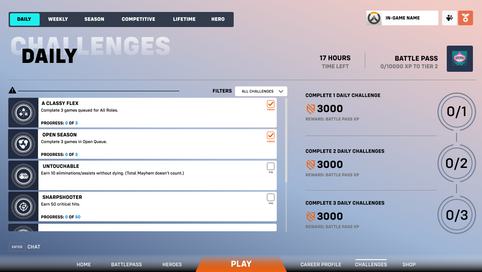
The team looked through several pain points from streamers, redditors and friends in general, which led us to wanting to reimaging certain aspects of how Overwatch 2 dealt with its overall user experience. Here we looked at several screens and while we did not change the information presented, what we tweaked was HOW it was presented.
PAIN POINTS

Menu
Additional menu unnecessary as it adds up too many navigational points. (Options here are visible in the "Home Screen", except for settings and exit.)
As an AAA game title , a high level of polish is needed for visuals, which certain screens lack.

Battle Pass
Reward types are unclear (only visible on a faded text while others have an icon)

Home Screen
Floating Dock only displays Socials and Battle Pass, both of which are available as buttons.
Too much empty unused space on the right side, home screen is extremely minimal for a game with many forms of stats and progression.
Right-click profile on the dock not clear to new players.

Statistics Page
Statistics page can only be sorted by game modes. Players should be able to sort by stats such as win rate %, damage dealt, etc., so that players can easily find out what is their nest heroes.
Currently, to compare heroes' stats, players have to memorise or screenshot the stats, change heroes, then compare it based off memory or the screenshot.
Change Hero button does not have a way to show all hero stats which is the default when clicked on "statistics".
PROPOSED SOLUTIONS
Redesigned Home Screen:
Convert current game UI to something players of other PVP games are familiar with.
Remove unnecessary menu screens and reduce the number of clicks required for players to navigate.
Add Functionality to the Universal Dock:
Universal dock should be easily navigable from all screens and provide crucial information for players.
Revised Navigation Flow:
Reduce hiding of screens.
Reduce number of clicks required for players to get to a certain screen.
Better visibility on statistics through blocking out spaces.
Revamped Statistics Page:
For any filtration, layout changed to easily compare all statistics across all heroes.
Revised Battle Pass Page:
The Battle Pass page should incentivize players to want to complete missions through an enticing page, clearly displaying rewards.
ITERATIVE PROCESS
We looked at our intended audience, new players who have played games but do not frequently play games. We charted out a user journey to understand where we could tweak and focus our efforts on to ensure a better experience.

LOW FIDELITY
Key Design Considerations:
With our low fidelity, we blocked out key elements of the screens that we wanted to change. For example, in the battle pass screen, we kept to roughly the same layout as the original, but with the intention of changing how certain information is shown.
MID FIDELITY
Key Design Considerations:
In our Medium Fidelity, we received a lot of feedback especially from the experienced/frequent overwatch players that the overall design was still not as appealing/clear. Hence, we redesigned some screens, the Battle Pass especially, to help elevate it since that is the main core point for monetization.
FINAL PROTOTYPE
Changes:
Based on our findings, we decided to overhaul most of the UI (save for some icons) and clean up the entire flow for players experiencing Overwatch 2 either for the first time or for a while. Reducing the number of clicks required to access information, as well as making core functions accessible regardless of where the player is currently at in the flow. (Unless they are in game of course).
Solution:
Removing the "Menu" and cutting it down to just a main home screen.
Settings and Quit Game options have been shifted to the home screen.
Added a "News" page in the home screen to help boost promotional content.
Changed the Battle Pass screen to better display and promote the items and monetization options.
Changed mouse functions so that all right-click only buttons are now left-clickable, to make things less confusing.
Universal Dock (above and below) exists on all pages for greater and quicker access to major parts of the game.
POST MORTEM
Full Dev process only available on Desktop.
What went well:
Working on a game app feels more intuitive for the team.
It was interesting to relook at a famous game title and offer our insights into improving what is supposedly an already polished product.
What didn’t go so well:
Time to work on this project was not as sufficient as we thought it would be, despite working on it exclusively in class.
What can be improved:
Overall some placement/UI issues can be sorted out. (No hierarchy, unnecessary objects in the file, etc.)
Miscommunication over some of the tasks given, which led to double work.


