A REIMAGINED LOOK
We take a look at Meta's very successful VR headset the Quest 2, and reimagine the overall user experience when dealing with the new technology. Over the course of this project, we redesign the experience from the ground up, starting with the physical headset, to when the user first engages with the product, and finally, when on daily use.
PAIN POINTS
User had to disconnect the headset during login, which broke the whole 'on-headset' flow.
User Dock was centered based on initial calibrated position, instead of moving with the headset. If it was calibrated while looking up, the user would be required to always look up when navigating.
Virtual Keyboard replicated a physical keyboard, instead of ergonomically fitting keyboard design.
UNDERSTANDING USERS
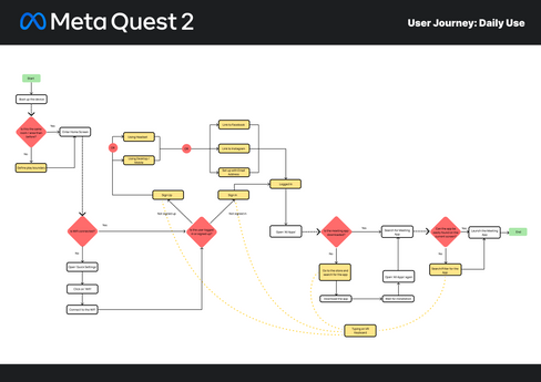
We drafted the initial flow targeting first-time users who were getting their first hands-on experience with the Quest 2. We charted out two separate user journeys that covered the first signup experience, and the subsequent simulated use in a corporate situation.
ITERATIVE PROCESS
We take a look at Meta's very successful VR headset the Quest 2, and reimagine the overall user experience when dealing with the new technology. Over the course of this project, we redesign the experience from the ground up, starting with the physical headset, to when the user first engages with the product, and finally, when on daily use.


MEDIUM FIDELITY
After going through some troubles with physical prototypes, moving towards the digital prototype helped to remove some human error with the printing, cutting and readability of the prototype.
People generally had a better experience testing with this greybox version of the prototype.
Placement of the dock was the biggest challenge we had as we wanted to test customizability of the dock.


MEDIUM HIGH FIDELITY
Based on the feedback, we fixed some glaring issues and grammar errors. Directly following the Quest 2 UI mockup, we adopted its color scheme in an attempt to keep the familiarity among current users.
Changing some of the UI layouts for the dock also kept new users in a familiar environment as they are placed accordingly.


HIGH FIDELITY
After confirming that the prototype’s stability was robust enough, we moved onto the high fidelity mockup to try and map out the full experience, from start to end.
With the revised new user setup and log in flow, complete with a redesign of the full app flow. We also integrated images to help users during their setup sequence alongside with textual cues.

PROTOTYPE
Changes:
Based on our previous findings, we have decided to improve on the prototype and focus on the digital aspect of it. Due to our limitations in aquiring the hardware on a regular enough basis, we could only work on the digital side of things as we could still test without the need for a VR headset or building one to test the changes to the ergonomics.
Solution:
Proposing a change to the Eye Piece, where users could turn a dial on the side of the headset to adjust the internal eye piece.Improved setup and login flow to make the setup for streamlined for new users.Improved dock that allows customisation and a better view.
POST MORTEM
Full Dev process only available on Desktop.
What went well:
We had a prototype that was challenging and it allowed all of us to envision design from an emerging technology, which is not yet fully explored.
Everyone had an enjoyable experience despite taking on a topic that was not familiar.
What didn’t go so well:
Time crunch was definitely an issue, but this was due to us working only within class time.
Unfamiliar topic caused some head scratching, even at times when the team was unclear on how to proceed or if the content was up to standard.
We could have better planned our schedule as we had overlapping tasks during the high fidelity production. Could have mitigated this by letting each other know before attempting to start on a task on their own.
Findings:
We found that it is deceptively hard to represent, illustrate, and tweak concepts that are unique to 3D VR space on a 2D canvas.
There were many UX conventions that seemed to be broken when showed on a 2D mockup, but were in fact to make the experience smoother in 3D space where the user’s head movement and body positions applies rather than just a cursor.


