

ABOUT THE GAME
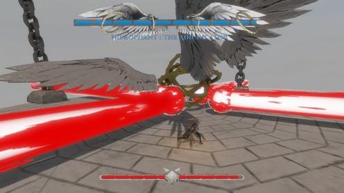
Iconoclasm: Fall of the False God, is a Third Person, Action Hack n' Slash game. Play as Los, the last survivor of the four vixens, to take down the Arcana and free the world.
Chain attacks to get Fox Tail charges and unleash special attacks to help your fight. Simple RPG pickups will give a boost to Los' fighting capabilities.

RESPONSIBILITIES
The team consisted of very talented individuals well versed in their craft (Art and Programming). From a design standpoint, I was in charge of ensuring all these elements gelling well together in a structured and cohesive manner. This was also the first time we worked on a project of this scale and scope, which was 3 times bigger than the required scope.
With only one person working on the asset creation, I had to jump in to assist in making the smaller props, to help reduce the workload of our only artist, and also aid the gameplay designer in creating assets ready for him to animate and use in the game.
With all the workload, I had to approach managing the team slightly differently as the Producer. While not compromising the overall quality of the work produced, I had to ensure that the team did not go through burnout by tasking them efficiently and keeping a close eye on their progress with regular checks.


TEAM
CHALLENGES
Screenshots
Platform:
Duration:
Team Size:
Role:
Custom C++ Engine
8 Months
10
Producer
UI Designer
3D Artist
As a Producer, my responsibilities were to ensure project success. I had to ensure that tasks were properly planned, and tight deadlines were met. I also had to ensure that my team were not overwhelmed with tasks and their workload was well managed, but within scope.
As a UI/UX Designer, I was in charge of the design language and all of the game UI. I was in charge of creating a coherent user flow and a simple UI that was capable of enhancing the quick and snappy gameplay, while also not being too intrusive. As part of the experience design, I also crafted the cutscenes for all boss fights.
As the 3D Artist, I assisted the Lead Artist in creating small 3D assets to offload from her high intensity tasks. I also created animation ready 3D character models and rigged them for the animator to animate.
UI PRODUCTION PROCESS
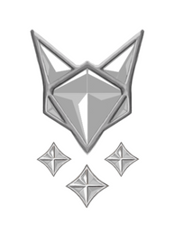
The initial process involved coming up with our theme. We were going for a Fox-like character and so the player facing UI would be fox-related. I took some references and came up with a basic outline for what would become our core gameplay UI, the fox tails. Alongside that, I also had to figure out a way to showcase the boss HP that was in a similar theme with the fox tails. Below are some screenshots of the iterative process where I experimented with different layouts and themes and ultimately decided on the center one.


Some of the earlier effects that I tried to explore included making the health bar for the player, to be within the fox face. Each segment would signify a part of the player's health, (Ears, Cheeks, Face) and would shatter upon losing health. This effect was done in Adobe AfterEffects as my first attempt in trying out the software in a bid to create more fluid UI animations. This was however scraped due to the size of the effect being too small to be noticed. We opted to remove that and stick to something more noticable.
For the boss bar, we were looking at something more Gothic, to fit with the art style, and looked at devil may cry for reference. Initial looks for the bar were kept to a flat, minimalistic feel, which we ultimately swapped out.

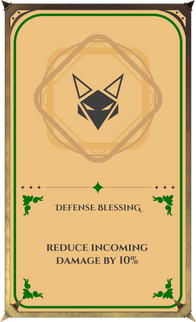
At the mid point mark, we had the opportunity to allow Nintendo to view our project, and after some deliberation, decided to add slight RPG elements into our game to enhance gameplay and encourage players to try different things every time they play the game. To that, I took inspiration from Genshin Impact's Card UI during the Spiral Abyss game mode and did up something similar.
After our mid point mark, we decided to overhaul the UI to better incorporate our new game elements into the UI. We converted from a 2D UI to using our existing 3D models to better enhance visibility, and to create a better fit between our UI and the game world. This change was brought about through playtesting and feedback given from lecturers, and players. Through this, we overhauled the player health bar to take on elements from DMC to give it the brushed metal look. We have also brought back the tails and used that in conjunction with the fox tails that appear on the player when they gain a charge.
All of the Boss HUDs have been redesigned to incorporate elements of the Boss itself and to give players the sense of scale and invoke emotions of awe upon seeing the Boss HP bars. It would only do our carefully crafted boss designs justice to have a equally well crafted HP bar to go alongside it.

After gathering some more feedback to improve the look of the cards (and also to not make the mistake of basically copying what Genshin Impact had), I ended up designed icons, and symbols to better differentiate the cards.
I added colors that our target audience (gamers. and non-gamers) would pick up instantly.
- Red for Attack Related.
- Green for Health Related.
- Gold for Specials Related.
Keeping to a simple three color scheme has allowed players to make decisions fast, after the first initial read of the card descriptions. I also kept it short to minimize the time it would take players to read the cards.


Download the game now


